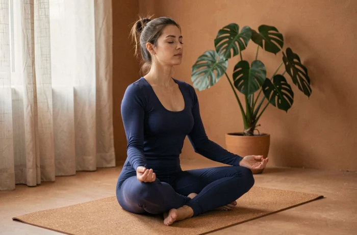
The carpet is rolled out in a room bathed in blue, an orange candle is lit, and the session seems smoother. The reflex is to attribute this comfort to the colors surrounding us.
The reality is more nuanced: a review published in 2026 (Beyond Associations Between Color and Emotion) shows that the emotional effects of colors are neither universal nor established as a general effect. What truly changes the experience is often a mix of lighting, time of practice, and personal expectations. Understanding these mechanisms allows for better arrangement of one’s yoga space, without falling into shortcuts.
Lighting, time of practice, and carpet color: what really affects yoga
When practicing yoga in the morning facing an east-facing window, the natural light is rich in warm tones. In the evening, the same room takes on cooler hues under artificial lighting. Research on circadian rhythms indicates that the intensity and timing of light matter more than the nominal hue of an object in influencing mood and sleep quality.
In other words, the color of your carpet or walls does not produce the same effect as direct light exposure. A red carpet in a dark room at 9 PM will not “energize” the nervous system like bright light would in the morning. Two distinct phenomena are often confused: the visual perception of a hue and the physiological exposure to a light spectrum.
To delve deeper into colors and well-being on Les Jardins Du Yoga, there are concrete insights that connect visual environment and daily practice.
In studios, lighting varies greatly from one place to another, and research highlights the lack of solid measurements in real conditions. Before repainting an entire room, it’s beneficial to test simple adjustments: dimming the light in the evening, prioritizing natural light in the morning, and observing what changes in the quality of the session.
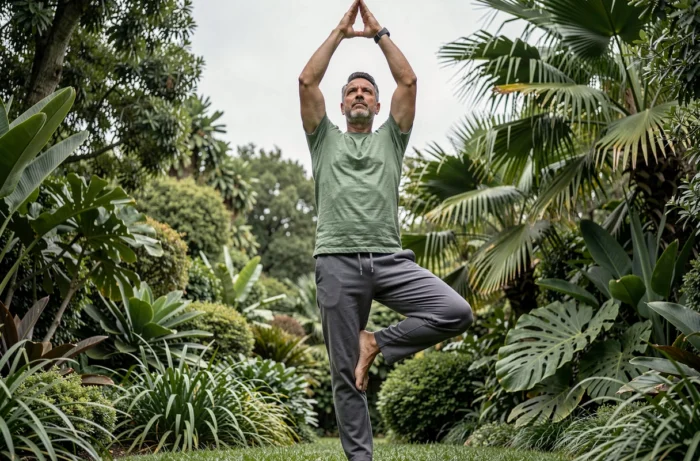
Colors and chakras in yoga: useful correspondences or fragile shortcuts
The yogic tradition associates each chakra with a color. Red for Muladhara (root), orange for Svadhisthana (creativity), yellow for Manipura (will), green for Anahata (heart), blue for Vishuddha (expression), indigo for Ajna (intuition), violet for Sahasrara (consciousness). These correspondences circulate everywhere, from online classes to yoga mat shops.
The problem is not the grid itself, but how it is used. Wearing purple leggings will not “open” the seventh chakra. Color-chakra correspondences are visualization aids, not therapeutic prescriptions. During a guided meditation, visualizing a specific color at a body area can help focus attention. It’s a concentration tool, comparable to a mantra or a visual focal point.
What works in practice
These associations can be used as a thread throughout the session. For example, working on grounding postures (Virabhadrasana, Malasana) while visualizing a warm hue at the pelvis helps some practitioners stay focused on sensations in the lower body. The effect comes from directed intention, not the color itself.
The nuance often missing in colorful yoga guides: the same color does not produce the same feeling for everyone. Emotional associations vary according to culture, personal history, and context. A deep blue may evoke calm for one person and melancholy for another.
Creating a yoga space at home: color choices and pitfalls to avoid
Rather than following a universal recipe (“paint your walls pastel blue for serenity”), better results are obtained by elimination and testing.
- Start with light before paint: a north-facing room with cold lighting will not react like a sun-drenched space, regardless of wall color
- Limit the number of bright hues in the direct visual field: during a balance pose or open-eyed meditation, a visually cluttered environment disperses attention
- Test with textiles before repainting: a blanket, a meditation cushion, or a curtain is enough to assess if a hue alters your comfort during practice
- Observe over several sessions: a color may be pleasing at first but become annoying after two weeks, and the opposite is also true
The most common pitfall is trying to replicate the ambiance of a studio you love without considering your own space. A spectacular terracotta wall in a glass-walled loft can become oppressive in a twelve-square-meter bedroom with a single window.
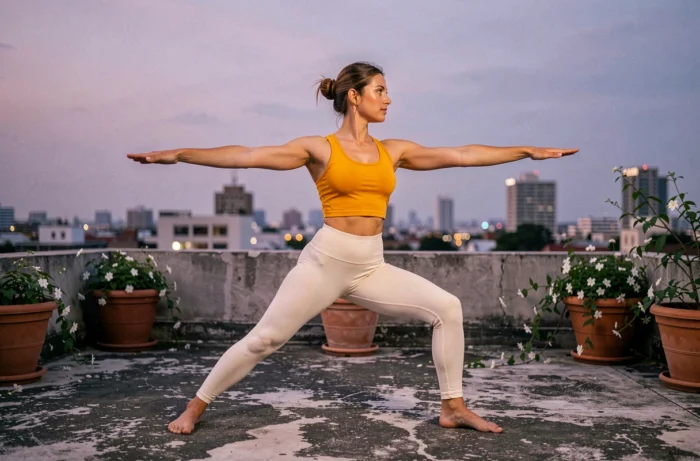
Yoga and colors in daily life: integrating the visual dimension without over-investing
Beyond the practice space, color can be used as a sensory marker throughout the day. A meditation cushion in a distinct hue from the rest of the furniture signals to the brain that it’s time to slow down. It is not the color that triggers relaxation; it’s the ritual associated with that object that gradually conditions the response.
The same principle applies to the choice of yoga clothing. Wearing an outfit reserved for practice creates a mental separation from the rest of the day. Whether this outfit is blue, black, or orange matters less than its function as a marker.
When color becomes a hindrance
Some practitioners spend more time searching for the “right” mat or the “right” color ambiance than actually practicing. If the choice of a color generates hesitation or frustration, it means attention has shifted from yoga to decoration. The best color for practicing is one that you forget once the session begins.
The evening light does not have the same effect as morning light on the body and mind. If there’s one thing to remember, it’s to focus on lighting and the timing of your session before questioning the palette of your space. Colors accompany practice; they do not replace it.